
Kitchen design is entering a new era where colour choices reflect deeper values of connection, sustainability and emotional well-being. Homeowners are moving away from stark minimalism towards palettes that celebrate warmth, natural inspiration and lasting aesthetic appeal. The shift represents not merely a stylistic evolution but a fundamental rethinking of how we experience our most essential living spaces. Designers are championing hues that foster tranquillity whilst simultaneously making bold statements about personal taste and environmental consciousness.
Energising trends: dynamic colours for 2026
The resurgence of vibrant greens
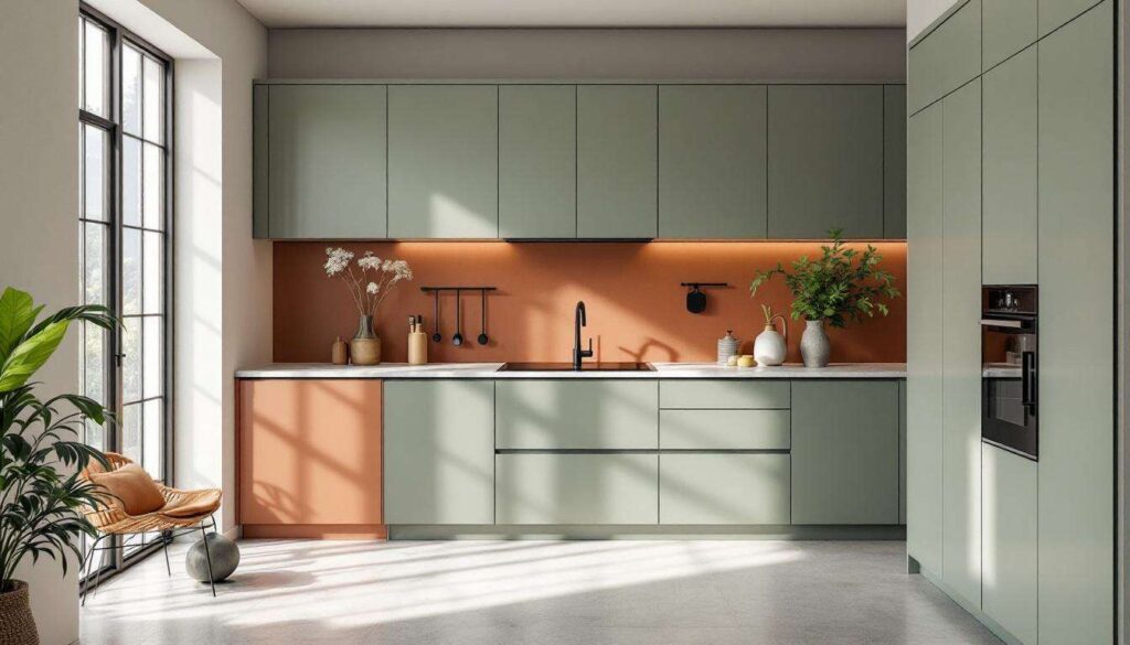
Green has emerged as the undisputed champion of kitchen colour trends, with 86% of designers predicting earthy green tones will dominate residential kitchens. This remarkable consensus reflects a collective desire to bring the outdoors inside, creating spaces that feel alive and rejuvenating. Avocado, sage and forest green are leading the charge, offering versatility that ranges from subtle sophistication to dramatic impact.
- Avocado green provides a retro-inspired warmth that pairs beautifully with brass fixtures
- Sage offers a softer, more meditative quality ideal for contemporary spaces
- Forest green delivers depth and richness, particularly effective on lower cabinetry
- Eucalyptus green brings a fresh, spa-like atmosphere to culinary environments
Energising accent strategies
Designers recommend incorporating dynamic colour accents through strategic placement rather than overwhelming entire rooms. Island units, feature walls or open shelving painted in vibrant hues create focal points without committing to full-room saturation. This approach allows homeowners to experiment with bolder choices whilst maintaining flexibility for future updates. The psychological benefits of these energising tones cannot be overstated, as they stimulate creativity and conversation in spaces designed for gathering and nourishment.
These vibrant choices naturally complement the broader movement towards organic aesthetics that define contemporary kitchen design.
Back to nature: reinvented natural tones
Earthy foundations for modern kitchens
Natural tones have been reimagined for modern sensibilities, moving beyond basic beiges to embrace clay-inspired neutrals and terracotta undertones. These colours evoke the raw beauty of natural landscapes whilst providing a sophisticated backdrop for daily life. The appeal lies in their ability to create warmth without sacrificing contemporary elegance, offering a middle ground between cold minimalism and overly traditional aesthetics.
| Natural Tone | Primary Application | Complementary Material |
|---|---|---|
| Terracotta | Accent walls, backsplash | Natural stone, copper |
| Clay neutral | Cabinetry, painted surfaces | Oak, walnut wood |
| Sandstone beige | Countertops, flooring | Porcelain, limestone |
Organic material integration
The natural colour palette extends beyond paint selections to encompass sustainable materials that reinforce the connection to earth. Light to medium natural woods add warmth and texture, whilst natural stone surfaces provide durability alongside aesthetic appeal. High-performance laminates now convincingly replicate organic materials, offering practical alternatives that maintain visual authenticity. This holistic approach ensures that colour, texture and materiality work in harmony to create cohesive, nature-inspired environments.
The grounding effect of these natural tones creates an ideal foundation for exploring softer, more delicate colour expressions.
Soft palette: pastels for a soothing kitchen
The calming influence of muted hues
Pastel palettes are experiencing a sophisticated renaissance, shedding associations with overly sweet aesthetics in favour of refined, soothing compositions. Soft pinks, powder blues and gentle lavenders are being deployed with restraint and intention, creating kitchens that feel like sanctuaries rather than purely functional spaces. These colours respond to the growing recognition that kitchens serve emotional as well as practical needs, offering respite from increasingly hectic lifestyles.
- Blush tones paired with marble create elegant, feminine spaces without feeling dated
- Soft grey-blues evoke coastal tranquillity whilst maintaining contemporary credibility
- Pale mint offers freshness that feels both nostalgic and forward-thinking
- Dusty rose provides warmth with unexpected sophistication
Art Nouveau influences
Designers are drawing inspiration from Art Nouveau aesthetics, incorporating soft tones with organic curves and flowing lines. This movement away from rigid geometry towards gentler forms complements pastel palettes perfectly, creating environments that feel both historically grounded and refreshingly modern. The psychological impact of these choices cannot be underestimated: pastel kitchens promote relaxation, encourage mindful cooking and create welcoming atmospheres for family gatherings.
Whilst pastels offer serenity, many homeowners seek the enduring appeal of classic neutral foundations.
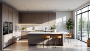
Warm neutrals: timeless elegance
The enduring appeal of cream and taupe
Warm neutrals continue to dominate kitchen design through their remarkable versatility and timeless aesthetic appeal. Cream, taupe and beige tones create welcoming atmospheres that transcend temporary trends, offering longevity that justifies kitchen renovation investments. These colours serve as sophisticated canvases that accommodate evolving décor preferences whilst maintaining inherent elegance.
Textured whites and layered neutrals
The key to successful neutral palettes lies in textural variation rather than colour contrast. Designers recommend layering multiple shades of white, cream and beige through different materials and finishes. Matte cabinetry paired with glossy backsplashes, textured plaster walls alongside smooth countertops, and varied wood grains create visual interest without chromatic complexity. This approach prevents neutral kitchens from feeling flat or sterile, instead cultivating depth and sophistication.
| Neutral Tone | Recommended Finish | Ideal Pairing |
|---|---|---|
| Warm white | Matte or eggshell | Natural oak, brass hardware |
| Greige | Satin | Marble, stainless steel |
| Soft taupe | Textured plaster | Walnut wood, bronze accents |
For those seeking more dramatic expressions, neutral foundations provide the perfect backdrop for adventurous colour experiments.
Striking contrasts: the art of bold colours
Matte black as the ultimate accent
The pairing of earthy greens with matte black accents represents one of the most sophisticated colour strategies emerging for contemporary kitchens. Olive or sage cabinetry combined with black fixtures, frames and hardware creates visual tension that feels both modern and grounded. This combination works particularly well in open-plan spaces, where the kitchen needs to make a statement whilst maintaining connection to adjacent living areas.
Strategic contrast implementation
Successful contrast relies on thoughtful proportion and placement rather than equal distribution. Designers recommend the following approaches:
- Dominant neutral or natural tone covering 60-70% of visible surfaces
- Secondary accent colour occupying 20-30% through cabinetry or walls
- Bold contrast elements comprising 10% via hardware, fixtures and accessories
- Unexpected pops of colour through artwork, textiles or small appliances
This measured approach prevents visual overwhelm whilst allowing personality to shine through. The psychological impact of contrast creates energy and definition, particularly valuable in multifunctional spaces where the kitchen must hold its own against competing design elements.
Bold colour choices gain additional dimension when supported by thoughtful material selections that add tactile richness.
Texture and depth: integrating natural materials
Material choices that enhance colour palettes
Colour cannot be separated from the materials that carry it, and designers are increasingly focused on sustainable, high-quality surfaces that combine aesthetic appeal with practical performance. Natural stone, porcelain and advanced laminates offer durability whilst supporting the broader colour narratives being established. These materials provide textural variation that prevents monochromatic schemes from feeling one-dimensional.
Creating multifunctional, clutter-free environments
The integration of kitchens into broader living spaces demands thoughtful storage solutions that reduce visual clutter whilst maintaining accessibility. Multifunctional islands serve as preparation zones, dining areas and social hubs, requiring colour treatments that transition seamlessly between functions. Well-designed storage zones allow colour palettes to breathe, preventing even the most carefully chosen hues from feeling overwhelming or chaotic.
| Material | Texture Quality | Colour Enhancement |
|---|---|---|
| Natural stone | Varied, organic veining | Adds depth to neutral palettes |
| Porcelain | Smooth, consistent | Provides clean backdrop for bold colours |
| Wood veneer | Grain variation, warmth | Softens contemporary colour schemes |
Kitchen colour trends reflect a fundamental shift towards spaces that nurture well-being whilst expressing individual values. The dominance of natural greens, warm neutrals and thoughtfully deployed contrasts demonstrates a collective desire for environments that feel both timeless and personally meaningful. Sustainable materials and multifunctional designs support these colour choices, creating kitchens that serve practical needs without sacrificing aesthetic ambition. By embracing palettes that evoke serenity and connection to nature, homeowners are crafting spaces designed for lasting satisfaction rather than temporary fashion. The most successful kitchens will be those that balance current trends with enduring principles of beauty, functionality and emotional resonance.