First impressions matter, particularly when it comes to interior design. A home should feel welcoming, polished, and thoughtfully curated, yet certain design choices can inadvertently create an impression of cheapness. Whether it’s poorly chosen colour palettes or an overload of mismatched accessories, these missteps can undermine even the most well-intentioned decorating efforts. Professional designers have identified common pitfalls that homeowners often overlook, along with strategic alternatives that elevate a space without requiring extravagant spending.
Clashing colours
The problem with uncoordinated palettes
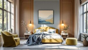
One of the most noticeable indicators of a poorly designed space is clashing colours that fail to harmonise. When walls, furniture, and accessories compete for attention with conflicting hues, the result is a chaotic and unsettling environment. Colour coordination is fundamental to creating visual cohesion, and without it, even expensive furnishings can appear cheap and haphazard.
Designer solutions for colour harmony
Professional designers recommend establishing a cohesive colour scheme from the outset. This approach typically involves selecting a neutral base palette and introducing carefully chosen accent colours through textiles, artwork, and decorative pieces. Consider the following strategies:
- Choose a maximum of three to four complementary colours throughout the space
- Use the 60-30-10 rule: 60% dominant colour, 30% secondary colour, and 10% accent colour
- Test paint samples in different lighting conditions before committing
- Consider the undertones of colours to ensure they work harmoniously together
| Common mistake | Designer alternative |
|---|---|
| Mixing warm and cool tones randomly | Stick to either warm or cool undertones throughout |
| Too many bold accent colours | Limit bold colours to one or two statement pieces |
| Ignoring natural light impact | Test colours in morning, afternoon, and evening light |
By establishing a thoughtful colour foundation, homeowners can ensure their spaces feel intentional and sophisticated. This careful attention to colour relationships naturally leads to considerations about how objects within the space interact with one another.
Overabundance of decorative objects
When more becomes less
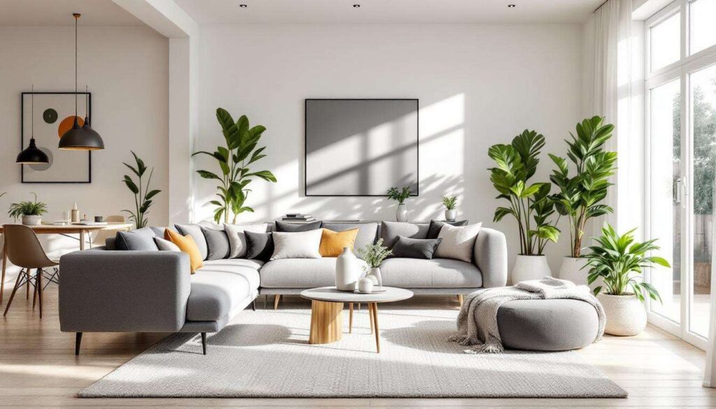
An excessive collection of decorative objects can quickly transform a room from stylish to cluttered. Whilst personal touches add character, too many trinkets, ornaments, and accessories create visual noise that overwhelms the senses. Every surface laden with knick-knacks suggests a lack of editing and can make even high-quality pieces appear cheap and insignificant.
The art of curated display
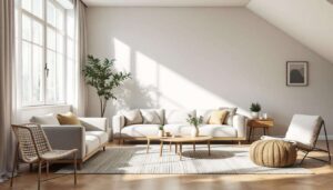
Designers advocate for a curated approach to decorative objects, where each piece serves a purpose and contributes to the overall aesthetic. The principle of “less is more” applies particularly well here, allowing individual items to shine and make a statement. Consider these professional techniques:
- Group objects in odd numbers (three or five) for visual appeal
- Vary heights and textures within grouped displays
- Leave negative space to allow the eye to rest
- Rotate seasonal decorations rather than displaying everything simultaneously
- Choose quality over quantity when selecting decorative pieces
Strategic placement matters
The placement of decorative objects is equally important as their selection. Strategic positioning can draw the eye to architectural features or create focal points within a room. Designers recommend placing larger statement pieces at eye level and using smaller accessories to complement rather than compete. Breathing room between objects prevents the cluttered appearance that cheapens a space.
Once decorative objects are thoughtfully arranged, the way they are illuminated becomes crucial to their presentation and the overall ambience of the room.
Inadequate lighting
The impact of poor lighting choices
Inadequate lighting ranks amongst the most common yet overlooked factors that make a home appear cheap. Relying solely on harsh overhead lighting or insufficient light sources creates unflattering shadows and fails to showcase a room’s best features. Lighting quality affects not only functionality but also the perceived value and atmosphere of a space.
Layered lighting approach
Professional designers employ a layered lighting strategy that incorporates three distinct types of illumination. This multi-dimensional approach ensures rooms are both functional and atmospheric, with flexibility to adjust lighting based on time of day and activity. The three essential layers include:
- Ambient lighting: general illumination from ceiling fixtures or recessed lights
- Task lighting: focused light for specific activities such as reading or cooking
- Accent lighting: decorative lighting that highlights artwork, architecture, or focal points
| Lighting mistake | Professional solution |
|---|---|
| Single overhead fixture only | Combine ceiling, table, and floor lamps |
| Incorrect bulb temperature | Use warm white (2700-3000K) for living spaces |
| No dimmer switches | Install dimmers for adjustable ambience |
| Exposed bulbs in cheap fixtures | Invest in quality lampshades and fixtures |
Quality fixtures make a difference
The fixtures themselves contribute significantly to a room’s aesthetic. Quality light fittings act as decorative elements whilst providing essential illumination. Designers suggest investing in statement pieces for prominent areas and ensuring all fixtures complement the overall design scheme. Proper positioning of light sources eliminates harsh shadows and creates a welcoming glow that enhances the space.
Just as lighting requires thoughtful consideration, the selection and arrangement of furniture demands equal attention to avoid common pitfalls.
Overly matched furniture
The monotony of matching sets
Purchasing complete furniture sets from a single collection might seem convenient, but this approach often results in a showroom-like appearance that lacks personality and sophistication. Matching furniture creates a monotonous visual landscape that suggests a lack of thought and individual style, making spaces feel generic and uninspired.
Mixing with intention
Designers recommend mixing furniture styles, periods, and finishes to create depth and visual interest. This eclectic approach requires a discerning eye to ensure pieces complement rather than clash, but the result is a collected, sophisticated look that appears to have evolved over time. Key principles include:
- Combine different wood tones rather than matching exactly
- Mix modern pieces with vintage or antique finds
- Vary furniture leg styles and silhouettes
- Unite disparate pieces through consistent colour palette or scale
- Invest in one statement piece per room and build around it
Creating cohesion through contrast
The secret to successfully mixing furniture lies in finding common threads that tie diverse pieces together. This might be a repeated colour, similar scale, or complementary design era. Intentional contrast adds visual excitement whilst maintaining harmony, preventing the space from appearing either too matchy or chaotically mismatched.
Beyond furniture selection, the overall organisation and presentation of belongings significantly influences how refined a home appears.
Cluttered home
The cost of clutter
A cluttered environment instantly undermines any design efforts, making even well-chosen furnishings appear cheap and poorly considered. Visual chaos created by excessive possessions, disorganised surfaces, and overcrowded rooms signals a lack of care and attention to detail that no amount of expensive decor can overcome.
Implementing effective storage solutions
Professional designers prioritise functional storage that keeps clutter at bay whilst maintaining aesthetic appeal. The goal is to create designated homes for belongings, ensuring surfaces remain clear and spaces feel open and breathable. Effective strategies include:
- Invest in furniture with built-in storage capabilities
- Use decorative boxes and baskets to conceal everyday items
- Implement the “one in, one out” rule for new purchases
- Regularly assess and remove items that no longer serve a purpose
- Keep countertops and surfaces 80% clear
The minimalist mindset
Adopting a more selective approach to possessions transforms both the appearance and functionality of a home. Thoughtful curation means displaying only items that are either beautiful, useful, or deeply meaningful, whilst storing or discarding the rest. This discipline creates breathing room that allows architectural features and carefully chosen furnishings to shine.
| Cluttered space indicator | Designer remedy |
|---|---|
| Overcrowded bookshelves | Display books with decorative objects, leave gaps |
| Visible cables and wires | Use cable management systems and conceal technology |
| Overflowing wardrobes | Seasonal rotation and ruthless editing of clothing |
| Cluttered kitchen counters | Store appliances when not in use, limit display items |
Creating a home that exudes quality and sophistication requires attention to multiple design elements working in harmony. By avoiding clashing colour schemes, resisting the temptation to over-decorate, implementing proper lighting, mixing furniture thoughtfully, and maintaining an organised environment, homeowners can achieve a polished aesthetic regardless of budget. These professional strategies demonstrate that perceived value comes not from expensive purchases but from thoughtful, intentional design choices that reflect personal style whilst adhering to timeless principles of good taste.