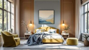

The colour scheme of a bedroom plays a crucial role in determining the quality of rest one experiences each night. Interior designers have long understood that certain hues possess the ability to influence mood, lower stress levels, and create an environment conducive to deep, restorative sleep. Scientific research supports these observations, revealing that our visual surroundings directly affect heart rate, blood pressure, and the production of sleep-inducing hormones. Selecting the appropriate palette for a bedroom extends beyond aesthetic preferences; it represents a strategic decision that can significantly improve overall wellbeing and sleep patterns.
Soothing colours for better quality sleep
Understanding the psychology of colour in sleep environments
The connection between colour and sleep quality stems from how our brains process visual stimuli, even in dimly lit conditions. Certain wavelengths of light trigger specific neurological responses that either promote alertness or encourage relaxation. Interior designers recommend avoiding vibrant, saturated colours in sleeping spaces, as these tend to stimulate the nervous system rather than calm it. Instead, muted tones with lower saturation levels create a psychological environment that signals to the body that it is time to wind down.
Key characteristics of sleep-friendly colours
When selecting bedroom colours that support quality rest, several factors should be considered:
- Light reflectance values that prevent excessive brightness whilst maintaining adequate illumination
- Undertones that lean towards cool rather than warm, which tend to be less stimulating
- Saturation levels that remain moderate, avoiding both stark intensity and complete drabness
- Compatibility with natural light patterns throughout the day
These principles form the foundation for choosing any of the five colours that interior designers consistently recommend for bedrooms. Each colour offers unique benefits whilst adhering to these fundamental guidelines.
The influence of neutral tones on rest
Why neutrals create psychological comfort
Neutral tones such as beige, taupe, and soft grey have emerged as perennial favourites amongst sleep specialists due to their inherent versatility and calming properties. These colours lack the stimulating qualities of brighter hues, allowing the mind to settle without unnecessary visual distraction. The understated nature of neutrals creates a backdrop that encourages the brain to focus inward rather than processing external stimuli, facilitating the transition from wakefulness to sleep.
Practical applications of neutral palettes
Interior designers suggest implementing neutral tones through various approaches:
- Warm beiges with subtle pink or yellow undertones for rooms with limited natural light
- Cool greys with blue undertones for spaces that receive abundant sunlight
- Layered neutral schemes that incorporate multiple shades for visual depth without overstimulation
- Textural variations in similar neutral tones to add interest whilst maintaining tranquillity
Beyond neutrals, specific colour families offer distinct advantages for those seeking to optimise their sleeping environment through thoughtful design choices.
Why blue shades promote relaxation
The physiological effects of blue
Blue consistently ranks as the most recommended colour for bedrooms amongst interior designers, and research validates this preference. Studies have demonstrated that exposure to blue hues can lower blood pressure and reduce heart rate, creating ideal physiological conditions for sleep. The colour blue is associated with the sky and water, elements that humans instinctively find peaceful and reassuring. This evolutionary connection means that blue environments trigger deeply rooted relaxation responses.
Selecting the right shade of blue
| Blue shade | Best for | Effect |
|---|---|---|
| Pale powder blue | Small bedrooms | Opens up space whilst maintaining calm |
| Medium cerulean | Master bedrooms | Balances sophistication with tranquillity |
| Soft periwinkle | Guest rooms | Universally appealing and restful |
| Muted slate blue | Contemporary spaces | Provides depth without heaviness |
Whilst blue offers exceptional benefits, another colour from nature provides equally compelling advantages for sleep quality.
The calming properties of green
Green as nature’s restorative colour
Green occupies a unique position in the colour spectrum, sitting between the coolness of blue and the warmth of yellow. This balanced placement makes it exceptionally easy on the eyes, requiring minimal adjustment from the optical system. Interior designers note that green bedrooms create an environment reminiscent of natural settings, which humans find inherently soothing. The association with foliage and growth subconsciously communicates safety and renewal, promoting psychological relaxation that facilitates sleep.
Implementing green in bedroom design
The versatility of green allows for numerous applications:
- Sage green for a sophisticated, mature aesthetic that remains gentle
- Mint green in rooms requiring a fresh, clean atmosphere
- Olive green for spaces with warm wood tones and natural materials
- Seafoam green to combine the calming properties of both blue and green
Another colour that shares green’s gentle qualities whilst offering a distinctly different character deserves consideration for those seeking alternatives.
Impact of mauve hues on sleep
The subtle sophistication of mauve
Mauve, a muted purple with grey undertones, represents an underutilised option in bedroom design despite its considerable benefits for sleep quality. Unlike vibrant purples that can be stimulating, mauve possesses a softness that promotes relaxation whilst adding visual interest. Interior designers appreciate how this colour bridges cool and warm tones, making it adaptable to various lighting conditions and design schemes. The complexity of mauve prevents monotony without introducing the overstimulation that brighter colours can cause.
Mauve’s psychological benefits
The effects of mauve on sleep quality include:
- Reduction of mental chatter through its meditative quality
- Creation of a cocoon-like atmosphere that encourages withdrawal from daily stresses
- Compatibility with both masculine and feminine design preferences
- Enhancement of evening ambience when artificial lighting is introduced
For those who prefer maximum simplicity and light reflection, one final colour option stands out as the ultimate choice.
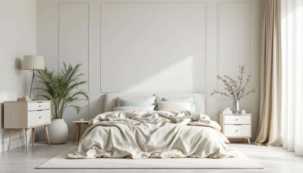
Using white for a serene sleeping space
The purity and versatility of white
White bedrooms offer unparalleled flexibility and a sense of spaciousness that can be particularly beneficial in smaller sleeping quarters. Contrary to concerns about starkness, properly executed white schemes create deeply peaceful environments. Interior designers emphasise that white serves as an ideal canvas for introducing texture through bedding, furniture, and accessories, allowing for visual interest without colour-based stimulation. The reflective properties of white maximise natural light during daytime hours whilst maintaining a clean, uncluttered appearance that supports mental clarity.
Avoiding common white bedroom mistakes
Successfully implementing white requires attention to specific details:
- Selecting warm whites with cream or ivory undertones rather than stark, cool whites
- Incorporating varied textures to prevent a clinical atmosphere
- Using layered lighting to create warmth during evening hours
- Adding natural materials such as wood and linen to introduce organic elements
When executed thoughtfully, white bedrooms provide a timeless, serene environment that supports consistent, quality sleep.
The colours selected for a bedroom wield considerable influence over sleep quality and overall wellbeing. Blue shades lower physiological arousal, green connects inhabitants with nature’s restorative qualities, neutral tones provide psychological comfort, mauve offers sophisticated tranquillity, and white creates spacious serenity. Interior designers consistently recommend these five colours because they share fundamental characteristics: low stimulation levels, appropriate light reflectance, and psychological associations with calm and safety. Implementing any of these colours thoughtfully, with attention to undertones, saturation, and complementary elements, transforms a bedroom into a true sanctuary for rest.