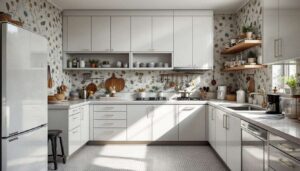

Kitchens have become the heart of modern homes, yet certain design choices can undermine their appeal and make them appear dated or cheap. Professional interior designers have identified specific elements that consistently detract from a kitchen’s aesthetic value, transforming what should be a sophisticated space into one that feels tacky and poorly considered. Understanding these pitfalls allows homeowners to make informed decisions that preserve both style and value.
Poor quality materials
The impact of cheap countertops and cabinetry
Nothing signals a budget kitchen quite like substandard materials. Designers consistently point to laminate countertops with visible seams, particle board cabinetry with peeling veneer, and thin vinyl flooring as immediate indicators of a low-quality space. These materials not only look cheap but also deteriorate rapidly, requiring frequent replacement and ultimately costing more in the long term.
Quality materials provide tangible benefits beyond aesthetics:
- Natural stone or engineered quartz countertops offer durability and timeless appeal
- Solid wood or high-quality plywood cabinetry maintains structural integrity for decades
- Genuine tile or quality vinyl plank flooring withstands daily wear whilst maintaining appearance
- Proper hardware with substantial weight and finish elevates the entire space
Recognising material quality
The difference between premium and poor materials becomes apparent upon close inspection. Cheap materials often feature inconsistent patterns, hollow sounds when tapped, lightweight construction, and visible manufacturing defects. Investing in mid-range to high-quality materials for key elements creates a foundation that resists the tacky label whilst providing better functionality and longevity.
Material choices set the foundation for kitchen aesthetics, but colour selections play an equally crucial role in determining whether a space feels current or outdated.
Outdated colours
Colour trends that have overstayed their welcome
Certain colour schemes immediately date a kitchen and create a tacky appearance. Designers particularly criticise the overuse of builder-grade beige, yellow-toned oak finishes, and the once-popular combination of cherry wood with black granite. These palettes dominated previous decades but now signal a space that hasn’t evolved with contemporary tastes.
| Outdated Colour | Modern Alternative | Design Impact |
|---|---|---|
| Golden oak cabinets | White oak or walnut | Fresh, sophisticated appearance |
| Harvest gold appliances | Stainless steel or panel-ready | Timeless, professional aesthetic |
| Tuscan terracotta walls | Soft grey or warm white | Clean, versatile backdrop |
| Black granite with gold veining | White marble or quartzite | Bright, elegant feel |
Creating a timeless colour palette
The most successful kitchens employ neutral foundations with carefully considered accent colours. White, grey, navy, and natural wood tones provide flexibility and longevity. Accent colours can be introduced through easily changeable elements like textiles, artwork, and small accessories rather than permanent fixtures, allowing the space to evolve without requiring major renovation.
Whilst colour creates mood and style, the sheer quantity of decorative elements can overwhelm a space and create visual chaos.
Overload of decorative elements
When more becomes less
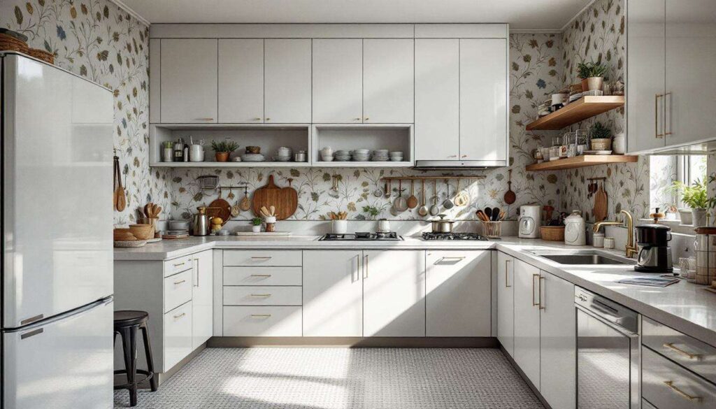
Designers universally condemn the tendency to over-accessorise kitchens with excessive decorative items. Countertops cluttered with appliances, walls covered in themed décor, and open shelving crammed with mismatched items create a chaotic, tacky appearance that obscures the kitchen’s architectural features and functional purpose.
Common decorative mistakes include:
- Collections of roosters, grapes, or other themed kitsch displayed prominently
- Excessive signage with food puns or wine-related quotes
- Too many small appliances permanently occupying counter space
- Artificial fruit arrangements and dusty decorative bottles
- Overly busy backsplash patterns competing with other elements
The principle of restraint
Professional designers advocate for curated minimalism in kitchen decoration. Select a few high-quality pieces that serve both functional and aesthetic purposes. A single statement vase with fresh flowers, a carefully chosen piece of art, or a beautiful cookbook display creates intentional elegance rather than accidental clutter. Clear countertops not only look more sophisticated but also provide practical workspace for cooking activities.
Beyond what occupies the space, how that space is illuminated dramatically affects its overall impression and functionality.
Inadequate lighting
The consequences of poor illumination
Lighting deficiencies rank among the most common factors making kitchens appear cheap and uninviting. A single overhead fixture casting harsh shadows, lack of task lighting for work surfaces, and the absence of ambient lighting options create a flat, unwelcoming atmosphere that undermines even quality materials and thoughtful design.
Layered lighting strategies
Sophisticated kitchens employ multiple lighting types working together to create functional elegance:
- Ambient lighting providing overall illumination through recessed fixtures or semi-flush ceiling lights
- Task lighting positioned under cabinets to illuminate work surfaces effectively
- Accent lighting highlighting architectural features or display areas
- Pendant fixtures over islands creating visual interest and focused light
- Dimmer switches allowing adjustment for different times and activities
Proper lighting transforms a kitchen from merely functional to genuinely inviting, but the appliances themselves must also contribute to a cohesive aesthetic rather than disrupting it.
Mismatched appliances
The visual discord of inconsistent finishes
Few things create a more haphazard, tacky appearance than appliances in conflicting finishes and styles. A white refrigerator beside a black dishwasher next to a stainless steel cooker signals a kitchen assembled without consideration for visual harmony. This piecemeal approach immediately communicates budget constraints and lack of planning.
| Appliance Finish | Best Pairing | Avoid Mixing With |
|---|---|---|
| Stainless steel | Same finish throughout | White, black, or bisque |
| Panel-ready | Custom cabinetry panels | Exposed mismatched finishes |
| Black stainless | Consistent black stainless | Traditional stainless or white |
| White | All white appliances | Stainless or coloured appliances |
Achieving appliance cohesion
When replacing appliances, prioritise matching finishes even if it means staggering purchases over time. Panel-ready appliances offer the ultimate in cohesion by allowing refrigerators and dishwashers to blend seamlessly with cabinetry. For those unable to replace all appliances simultaneously, appliance paint kits provide a temporary solution, though designers recommend planning for proper replacements as budget allows.
Whilst major appliances command attention, smaller details can equally undermine a kitchen’s sophistication.
Visible plastic details
The cheapening effect of plastic elements
Designers consistently identify visible plastic components as subtle yet significant contributors to a tacky appearance. Plastic soap dispensers, cheap plastic bins without proper housing, plastic utensil holders on countertops, and plastic switch plates all broadcast a budget-conscious approach that undermines investment in other areas.
Upgrading to quality alternatives
Replacing plastic elements with more substantial materials creates immediate improvement:
- Glass, ceramic, or stainless steel soap dispensers instead of plastic bottles
- Pull-out bins concealed within cabinetry rather than visible plastic containers
- Metal or wood utensil crocks replacing plastic holders
- Brushed metal or matching switch plates instead of standard plastic
- Proper drawer organisers in wood or metal rather than plastic inserts
These seemingly minor upgrades collectively elevate the entire space, demonstrating attention to detail and commitment to quality throughout the kitchen.
Avoiding a tacky kitchen requires conscious decisions about materials, colours, decoration, lighting, appliance coordination, and even the smallest details. Quality materials provide longevity and inherent sophistication, whilst thoughtful colour choices ensure the space remains current. Restraint in decoration allows architectural features to shine, proper lighting creates ambience and functionality, coordinated appliances establish visual harmony, and eliminating cheap plastic details demonstrates comprehensive attention to quality. By addressing these eight elements, homeowners create kitchens that feel considered, sophisticated, and genuinely welcoming rather than dated and cheap.