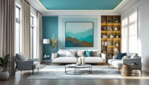


Walls have long been the canvas for our interior design aspirations, but the latest decorating movement is challenging traditional approaches to paint application. Colour capping has emerged as a transformative technique that involves painting the upper portion of walls, including the ceiling, in a distinct hue whilst leaving the lower section in a contrasting shade. This architectural paint treatment creates visual interest, alters perceived room dimensions, and introduces a sophisticated layer of depth to any space. Interior designers and homeowners alike are embracing this method as a fresh alternative to conventional wall treatments, discovering its remarkable versatility across diverse architectural styles and room functions.
Introduction to colour capping: the 2026 trend
What defines colour capping
Colour capping refers to the practice of extending a wall colour upwards to encompass the ceiling, creating a cap of colour that wraps the upper portion of a room. Unlike traditional painting methods that treat walls and ceilings as separate entities, this technique blurs the boundaries between these architectural elements. The division typically occurs at picture rail height or approximately two-thirds up the wall, though positioning varies according to ceiling height and desired effect. This approach transforms the fifth wall into an integral component of the overall colour scheme rather than relegating it to standard white.
Origins and evolution of the technique
Whilst colour capping may appear contemporary, its roots trace back to historical decorating practices where darker colours adorned upper walls and ceilings in grand estates. The technique has been reimagined for modern interiors, shedding its formal associations to become accessible for everyday homes. Contemporary interpretations favour softer transitions and unexpected colour combinations that reflect current design sensibilities. The resurgence stems from a collective desire to move beyond safe, neutral palettes towards bolder expressions of personal style.
Understanding the fundamentals of this technique provides the foundation for exploring its practical applications throughout the home.
The benefits of colour capping in interior decoration
Altering spatial perception
One of the most compelling advantages of colour capping lies in its ability to manipulate perceived room dimensions. When darker shades cap a room, they draw the eye downward, making lofty ceilings feel more intimate and grounded. Conversely, lighter caps can lift spaces with lower ceilings, creating an impression of increased height. This optical illusion proves particularly valuable in properties with challenging proportions where architectural modifications aren’t feasible.
| Ceiling Height | Recommended Cap Colour | Visual Effect |
|---|---|---|
| High (3m+) | Darker tones | Creates cosiness, reduces echo |
| Standard (2.4-2.7m) | Mid-tones or contrast | Adds character without compromise |
| Low (below 2.4m) | Lighter shades | Enhances sense of height |
Adding architectural interest
Colour capping introduces architectural detail to otherwise plain spaces without the expense of mouldings or structural alterations. The horizontal line created by the colour division acts as a visual feature that draws attention and adds complexity to simple room layouts. This proves especially beneficial in new-build properties that often lack period features, providing an instant injection of character and sophistication.
Creating cohesive design schemes
This technique facilitates colour flow between adjacent spaces, particularly effective in open-plan layouts where distinct zones require subtle definition. By carrying a cap colour from one area into another, designers establish visual connections that unify disparate functions whilst maintaining individual character. The method also allows for experimentation with bolder hues that might overwhelm if applied to entire walls, making adventurous colour choices more approachable.
With these advantages established, the question naturally turns to selecting appropriate colours for different spaces.
How to choose the ideal colour for each room
Assessing room function and atmosphere
The intended use of a space should guide colour selection for capping treatments. Active areas such as kitchens and home offices benefit from energising yet focused hues, whilst relaxation zones call for calming palettes. Consider the emotional response desired: warm terracottas and ochres foster conviviality in social spaces, whilst cool blues and greens promote tranquillity in private retreats.
Evaluating natural light conditions
Natural light profoundly affects how colours appear throughout the day. North-facing rooms receive cooler, more consistent light that can render certain shades flat or dull, making warmer caps advisable to counteract this effect. South-facing spaces flooded with warm light can accommodate cooler tones without appearing stark. East and west-facing rooms experience dramatic shifts between morning and evening, requiring colours that perform well under varying conditions.
Coordinating with existing elements
Successful colour capping requires harmony with permanent fixtures and furnishings. Examine flooring, cabinetry, and architectural details to identify undertones that should be complemented or contrasted. Create a cohesive scheme by:
- Extracting colours from existing textiles, artwork, or statement pieces
- Using colour wheels to identify complementary or analogous relationships
- Testing large paint samples on multiple walls to observe how light affects appearance
- Considering the visual weight of furniture against proposed cap colours
Armed with selection criteria, attention can shift to practical implementation in specific rooms.
Tips for successful colour capping in the living room
Determining the optimal division point
In living rooms, the cap division typically sits at picture rail height or approximately 200-220cm from the floor. This positioning respects traditional proportions whilst accommodating modern ceiling heights. For rooms with existing architectural features, align the division with these elements to maintain visual logic. In spaces lacking such features, use masking tape to test various heights before committing to the final position.
Selecting colours for social spaces
Living rooms demand colours that facilitate conversation and relaxation without overwhelming. Warm neutrals such as terracotta, clay, or soft coral create inviting caps that enhance evening gatherings under artificial light. For contemporary schemes, consider deep greens or navy blues that provide sophistication without severity. The lower wall section might remain in off-white or pale grey to maintain brightness and prevent the space feeling enclosed.
Integrating with décor elements
Ensure the cap colour complements rather than competes with focal points such as fireplaces, media units, or feature walls. If statement furniture pieces dominate, opt for more subdued caps that provide backdrop rather than distraction. Conversely, in minimalist spaces with neutral furnishings, a bold cap introduces necessary visual interest. Coordinate soft furnishings, curtains, and accessories to echo or contrast with the cap colour, creating intentional design dialogue.
The principles established in communal spaces translate differently when applied to private sleeping quarters.
Creating a cosy atmosphere with colour capping in the bedroom
Embracing enveloping colour schemes
Bedrooms present an ideal opportunity for immersive colour experiences that might prove too intense elsewhere. Dark, saturated caps in shades like charcoal, forest green, or deep plum create cocoon-like environments conducive to rest. This approach works particularly well in larger bedrooms where darker colours won’t overwhelm. The enveloping effect fosters a sense of security and separation from the outside world, essential for quality sleep.
Balancing warmth and serenity
Achieving the right balance between comfort and calm requires careful consideration of colour temperature. Warm caps in muted terracotta or dusty pink promote relaxation whilst maintaining cosiness. Cooler options such as sage green or powder blue offer tranquillity without coldness, especially when paired with warm-toned bedding and wooden furniture. Test colours at different times of day, particularly evening hours when the bedroom sees most use.
Coordinating with textiles and lighting
Bedroom colour capping must work harmoniously with layered textiles and varied lighting sources. Consider how the cap colour appears under bedside lamps, which cast warmer light than overhead fixtures. Select bedding and curtains that either complement the cap through tonal variation or provide deliberate contrast. Metallic accents in light fixtures and hardware can bridge colour transitions, adding subtle sophistication to the overall scheme.
Beyond creating ambience, colour capping offers practical solutions for challenging spatial configurations.
Optimising small spaces with colour capping
Strategic colour placement for compact rooms
In smaller spaces, colour capping requires thoughtful execution to enhance rather than diminish perceived dimensions. Lighter caps extending from pale walls create upward momentum, making cramped rooms feel more spacious. Alternatively, wrapping a darker colour over walls and ceiling can paradoxically make tiny spaces feel intentionally intimate rather than accidentally small. The key lies in commitment: half-hearted colour choices often worsen spatial issues.
Maximising vertical emphasis
For rooms with limited floor space but adequate height, position the colour division higher than standard to emphasise vertical lines. This draws attention upward, making walls appear taller and the room more expansive. Pair this technique with vertical elements such as tall bookshelves, floor-to-ceiling curtains, or vertical panelling to reinforce the elongating effect. Avoid horizontal stripes or strong horizontal furnishings that counteract this vertical emphasis.
Creating zones in multipurpose areas
Small spaces often serve multiple functions, and colour capping can delineate zones without physical barriers. In studio flats or combined living-sleeping areas, different cap colours can distinguish functional zones whilst maintaining visual connection. Ensure colours relate through shared undertones or complementary relationships to prevent jarring transitions. This approach proves particularly effective when combined with furniture placement and lighting design to reinforce spatial divisions.
Even with careful planning, certain pitfalls can undermine colour capping efforts.
Avoiding common mistakes in applying colour capping
Preparation and execution errors
The most frequent mistake involves inadequate surface preparation, leading to uneven colour application and visible imperfections. Ceilings particularly require thorough cleaning, filling, and priming as overhead lighting highlights every flaw. Use quality masking tape to achieve crisp division lines, pressing edges firmly to prevent paint bleed. Apply multiple thin coats rather than single thick applications, which can result in drips and uneven coverage.
Proportion and placement miscalculations
Positioning the colour division incorrectly can disrupt room proportions. Common errors include:
- Placing the division too low, which truncates walls and reduces perceived height
- Creating divisions at awkward heights that don’t align with windows or architectural features
- Failing to maintain consistent division heights in connected spaces
- Ignoring how furniture placement affects the visual impact of the division line
Colour selection pitfalls
Choosing colours without adequate testing leads to disappointing results. Digital representations rarely match actual paint appearance, making physical samples essential. Test colours in the specific room under various lighting conditions over several days before committing. Avoid selecting colours in isolation; always consider how the cap and lower wall colours interact. Overly contrasting combinations can appear jarring, whilst insufficient contrast renders the technique pointless.
Colour capping represents a sophisticated approach to interior decoration that rewards careful planning and bold execution. By manipulating spatial perception, adding architectural interest, and creating cohesive design schemes, this technique transforms ordinary rooms into distinctive spaces. Success depends on thoughtful colour selection matched to room function, proper assessment of light conditions, and meticulous application. Whether creating intimate bedrooms, optimising compact spaces, or adding character to living areas, colour capping offers versatility that adapts to diverse design visions. Avoid common pitfalls through adequate preparation, accurate proportion calculations, and thorough colour testing to achieve professional results that elevate your interior spaces.