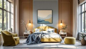

Bedroom colour schemes have become a focal point for interior design enthusiasts seeking to transform their personal sanctuaries into havens of style and comfort. The palette choices we make for our most intimate spaces reflect not only aesthetic preferences but also our desire for emotional well-being and restful environments. From soothing neutrals to bold statement shades, the spectrum of possibilities continues to evolve, offering fresh inspiration for those ready to reimagine their sleeping quarters with contemporary flair and timeless appeal.
Natural colours: the trend of soft shades
The appeal of nature-inspired neutrals
Soft natural colours have established themselves as the foundation of modern bedroom design, bringing organic warmth and understated elegance to sleeping spaces. These shades draw inspiration from the natural world, creating environments that feel both grounding and serene. The popularity of these hues stems from their remarkable versatility and their ability to complement various design styles whilst maintaining a sense of calm.
- Warm beige tones that evoke sandy beaches and sun-bleached driftwood
- Soft greige combinations that blend grey and beige for sophisticated neutrality
- Creamy ivory shades that add luminosity without stark brightness
- Gentle taupe hues that provide depth whilst remaining subtle
- Warm stone colours that ground the space with earthy authenticity
Implementing natural shades effectively
The success of natural colour schemes lies in layering different tones and textures to prevent the space from appearing flat or monotonous. Designers recommend incorporating various shades within the same colour family, using lighter tones on walls and introducing deeper variations through textiles, furnishings, and decorative accessories. This approach creates visual interest whilst maintaining the cohesive, peaceful atmosphere that natural colours provide.
| Natural shade | Best paired with | Lighting recommendation |
|---|---|---|
| Warm beige | White trim, natural wood | Warm white (2700K-3000K) |
| Greige | Charcoal accents, brass fixtures | Neutral white (3500K-4000K) |
| Ivory | Soft grey, natural linen | Warm white (2700K-3000K) |
These gentle, nature-inspired shades create the perfect foundation for those seeking a more delicate approach to bedroom colour.
Pastel hues: when tranquility steps in
The psychology behind pastel choices
Pastel colours have experienced a remarkable resurgence, moving beyond nursery associations to become sophisticated choices for adult bedrooms. These softened versions of more vibrant colours offer psychological benefits that make them particularly suitable for rest spaces. The muted intensity of pastels creates an environment that feels both uplifting and calming, striking a delicate balance that promotes relaxation without feeling sterile or cold.
Popular pastel options gaining momentum
Contemporary pastel palettes extend far beyond traditional baby blue and pink, embracing a wider spectrum of nuanced shades that feel fresh and current. Soft sage green has emerged as a particular favourite, bringing botanical freshness whilst maintaining the gentle quality characteristic of pastels. Powder blue continues to appeal for its serene qualities, whilst blush pink offers warmth without overwhelming intensity. Lavender tones provide a sophisticated alternative that combines the calming properties of blue with the warmth of red undertones.
- Soft sage: botanical freshness with calming properties
- Powder blue: classic serenity with timeless appeal
- Blush pink: gentle warmth that feels contemporary rather than childish
- Pale lavender: sophisticated purple with relaxing qualities
- Mint green: refreshing yet soothing, perfect for morning light
- Peachy cream: warm and enveloping without being overpowering
Whilst pastels offer lightness and airiness, some homeowners crave the opposite effect in their bedrooms.
Deep tones: for a cosy atmosphere
Embracing dramatic darkness
Deep, rich colours have gained significant traction amongst those seeking to create cocoon-like sanctuaries that feel protective and intimate. Contrary to conventional wisdom suggesting that dark colours make rooms feel smaller, when applied thoughtfully, these intense shades can actually make spaces feel more luxurious and enveloping. The key lies in balancing deep wall colours with adequate lighting, reflective surfaces, and lighter textiles to prevent the space from feeling oppressive.
Standout deep shade selections
Navy blue has established itself as the most popular deep tone, offering sophistication and versatility that works across various design aesthetics. Charcoal grey provides a modern alternative to black, delivering drama whilst maintaining neutrality. Forest green brings natural richness with a contemporary edge, whilst deep plum introduces unexpected elegance. These colours work particularly well in bedrooms with generous natural light or those used primarily in evening hours.
| Deep tone | Atmosphere created | Ideal room size |
|---|---|---|
| Navy blue | Sophisticated, calming | Medium to large |
| Charcoal grey | Modern, cocoon-like | Any size with good lighting |
| Forest green | Rich, natural | Medium to large |
| Deep plum | Luxurious, intimate | Medium rooms preferred |
These dramatic choices represent one end of the spectrum, whilst another trend draws from the earth itself.
The revival of earthy colours
Reconnecting with organic pigments
Earthy colours have experienced a significant revival as homeowners seek to establish stronger connections with the natural world within their living spaces. These hues, inspired by soil, clay, rust, and natural minerals, bring grounding energy and warmth that feels particularly relevant in contemporary life. Unlike the cooler natural neutrals, earthy tones lean towards warmer undertones, creating spaces that feel nurturing and authentic.
Key earthy shades making an impact
Terracotta has emerged as a frontrunner, bringing Mediterranean warmth and sun-baked richness to bedroom walls. Ochre yellow offers golden warmth without the brightness of traditional yellow, whilst burnt sienna provides deep, rustic elegance. Clay pink combines the softness of pastels with the groundedness of earth tones, creating a unique middle ground that feels both gentle and substantial.
- Terracotta: warm, Mediterranean-inspired with rustic charm
- Ochre: golden earth tones that add warmth without overwhelming brightness
- Burnt sienna: deep rust colours with sophisticated depth
- Clay pink: soft yet grounded, bridging pastels and earth tones
- Warm umber: rich brown with red undertones for cosy intimacy
- Desert sand: pale earth tones with subtle warmth
These organic hues pave the way for an entirely different category of colour that adds unexpected glamour.
The emergence of metallic shades in decor
Beyond accent pieces
Metallic shades have transcended their traditional role as mere accent colours, evolving into primary palette choices for adventurous decorators. Soft metallic wall finishes create subtle shimmer that changes throughout the day as natural light shifts, adding dynamic visual interest without overwhelming the space. These shades work particularly well in bedrooms where creating a sense of luxury and sophistication remains paramount.
Practical metallic applications
Champagne and soft gold tones offer warmth and elegance without the brashness of bright metallics, whilst pewter and silver shades provide cool sophistication. Rose gold has maintained its popularity, bringing warmth with contemporary appeal. The key to successfully incorporating metallic shades lies in using them with restraint, either as feature walls or in paint finishes that offer subtle reflection rather than mirror-like shine.
- Champagne: warm, luxurious with subtle golden undertones
- Pewter: cool sophistication with grey-silver depth
- Rose gold: contemporary warmth with feminine elegance
- Soft bronze: earthy metallics that complement natural schemes
- Platinum: cool, refined with understated glamour
The bedroom colour landscape continues to expand with options that cater to diverse tastes and design philosophies. Whether drawn to the serenity of natural neutrals, the gentleness of pastels, the drama of deep tones, the authenticity of earthy pigments, or the glamour of metallic finishes, homeowners have unprecedented choice in creating personalised sanctuaries. The most successful schemes often combine elements from multiple categories, layering colours and textures to achieve spaces that feel both current and timeless, reflecting individual personality whilst promoting the rest and rejuvenation that bedrooms should provide.