Transforming your living room with contemporary colours can breathe new life into your home whilst reflecting current design philosophies. The palette for this year embraces a sophisticated blend of nature-inspired tones and bold statement shades that designers are championing across the globe. From warm earthy hues to refreshing botanical tones, these carefully curated colours promise to create spaces that balance visual interest with comfort. Whether you’re planning a complete renovation or simply seeking to refresh your décor with new accessories, understanding these trending shades will help you make informed choices that stand the test of time.
The rise of amber neutrals
Understanding the appeal of warm neutral tones
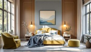
Amber neutrals have emerged as a dominant force in contemporary interior design, offering a sophisticated alternative to traditional beige and grey palettes. These warm, honey-toned shades bring depth and richness to living spaces whilst maintaining the versatility that neutrals are known for. The beauty of amber neutrals lies in their ability to shift throughout the day, appearing golden in morning light and deepening to a comforting caramel as evening approaches.
Practical applications in your living room
Designers recommend incorporating amber neutrals through various elements:
- Feature walls that create a warm backdrop for artwork and furnishings
- Upholstered furniture pieces such as sofas and armchairs
- Textiles including curtains, cushions and throws
- Decorative accessories like vases and picture frames
These versatile shades pair exceptionally well with natural materials such as wood, rattan and linen, creating a cohesive aesthetic that feels both current and timeless. The warmth of amber neutrals also complements metallic accents, particularly brass and copper, adding layers of visual interest to your space.
Combining amber with complementary colours
| Amber neutral shade | Best complementary colour | Recommended ratio |
|---|---|---|
| Light caramel | Teal blue | 70:30 |
| Deep honey | Sage green | 60:40 |
| Warm sand | Terracotta | 65:35 |
The flexibility of these warm neutrals makes them an ideal foundation for experimenting with bolder accent colours, seamlessly connecting to the vibrant botanical tones that are equally prominent this season.
Fresh botanical greens
The psychological benefits of green in living spaces
Botanical greens have captured the attention of interior designers for their calming properties and connection to the natural world. Shades ranging from misty mint to deeper moss tones create an atmosphere of tranquillity that is particularly valuable in living rooms where relaxation and social interaction converge. These colours have been shown to reduce stress levels and promote a sense of wellbeing, making them an excellent choice for spaces where you spend considerable time.
Popular green shades and their applications
The spectrum of botanical greens offers remarkable versatility:
- Sage green for walls, creating a subtle yet sophisticated backdrop
- Moss tones for accent furniture and larger decorative pieces
- Misty mint for accessories and soft furnishings
- Olive shades for grounding elements like rugs and curtains
These nature-inspired hues work beautifully in both traditional and contemporary settings, adapting to various design aesthetics with ease. When used on walls, botanical greens provide a refreshing alternative to white whilst maintaining a light, airy feel that doesn’t overwhelm smaller spaces.
Styling tips for botanical green schemes
To maximise the impact of botanical greens in your living room, consider pairing them with natural textures such as jute, bamboo and stone. These combinations reinforce the connection to nature whilst adding tactile interest. White or cream trim provides crisp definition, whilst wooden furniture in warm tones creates pleasing contrast. For those seeking a more dramatic look, combining deeper moss shades with the emerging trend of cooler, technology-inspired blues creates an intriguing balance between organic and modern aesthetics.
The influence of tech noir blues
Defining the tech noir aesthetic
Tech noir blues represent a contemporary evolution of traditional blue palettes, drawing inspiration from digital interfaces and modern technology. These shades, particularly glacier blue, offer a crisp, clean aesthetic that feels both futuristic and calming. Unlike warmer blues of previous years, tech noir blues lean towards cooler undertones, evoking images of ice, water and digital screens.
Creating harmony with glacier blue
Glacier blue excels at promoting serenity in living spaces whilst maintaining visual interest. This shade works particularly well in rooms with abundant natural light, where it can reflect and enhance brightness throughout the day. Designers favour glacier blue for:
- Accent walls behind entertainment centres or bookshelves
- Painted furniture pieces that serve as focal points
- Soft furnishings in rooms dominated by neutral tones
- Artwork frames and decorative objects
Balancing cool tones in warm spaces
| Tech noir blue application | Warming element | Effect achieved |
|---|---|---|
| Glacier blue walls | Terracotta accessories | Balanced temperature |
| Blue upholstery | Wooden coffee table | Natural harmony |
| Blue curtains | Brass fixtures | Sophisticated contrast |
The key to successfully incorporating tech noir blues lies in balancing their coolness with warmer elements, which naturally leads to exploring the vibrant warmth of coral-inspired shades that provide the perfect counterpoint.
Sunset coral shades
The warmth and energy of coral tones
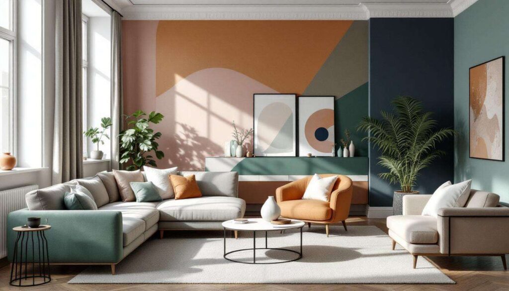
Sunset coral shades bring vitality and warmth to living rooms, offering a sophisticated alternative to traditional pink or orange hues. These colours capture the essence of golden hour, when the sky transforms into a palette of peachy, salmon and soft orange tones. The energising quality of coral makes it particularly suitable for living spaces where you entertain guests or seek to create an uplifting atmosphere.
Incorporating coral without overwhelming
Whilst coral is undeniably bold, strategic application ensures it enhances rather than dominates your space. Consider these approaches:
- Using coral as an accent colour on a single feature wall
- Incorporating coral through artwork and decorative objects
- Selecting coral-toned cushions and throws for seasonal flexibility
- Choosing coral lampshades that cast a warm, flattering glow
The beauty of sunset coral lies in its ability to complement both warm and cool palettes, making it remarkably versatile. When paired with cream or off-white walls, coral accessories create visual interest without overwhelming the senses. Combined with deeper neutrals or even glacier blue, coral provides an unexpected pop of colour that feels both current and timeless.
Coral in different lighting conditions
Understanding how coral behaves in various lighting situations is crucial for successful implementation. In rooms with southern exposure and abundant natural light, coral maintains its vibrancy throughout the day. In spaces with limited natural light, coral can appear more muted, which may actually be desirable for creating a subtle warmth. Evening artificial lighting enhances coral’s peachy undertones, creating an inviting and cosy atmosphere perfect for relaxation. This warmth naturally connects to the grounding qualities of earthy red tones that offer similar comfort with greater depth.
Earthy reds for a warm ambience
The resurgence of terracotta and rust tones
Earthy reds, particularly terracotta and rust shades, have experienced a remarkable resurgence in interior design. These colours draw inspiration from Mediterranean landscapes, clay pottery and natural earth pigments, bringing a sense of grounded warmth to contemporary living spaces. Unlike brighter reds that can feel aggressive, earthy reds offer sophistication and depth whilst maintaining their energising properties.
Applications for maximum impact
Terracotta works beautifully across various applications in the living room:
- Large area rugs that anchor seating arrangements
- Upholstered accent chairs that serve as statement pieces
- Ceramic vases and pottery displayed on shelving
- Textured wall coverings for tactile interest
- Cushions and throws layered with neutral furnishings
Pairing earthy reds with complementary elements
| Earthy red shade | Ideal pairing | Visual outcome |
|---|---|---|
| Terracotta | Brass accents | Warm elegance |
| Rust | Natural wood | Organic harmony |
| Clay red | Cream textiles | Balanced warmth |
The richness of earthy reds creates an inviting atmosphere that encourages gathering and conversation. These tones work particularly well with natural materials, reinforcing the connection between interior spaces and the natural world. Wood textures in warm finishes complement terracotta beautifully, whilst brass and bronze accents add a layer of sophistication. To complete a contemporary living room scheme, these organic tones benefit from the addition of reflective surfaces that introduce modern glamour.
Metallic accents for a modern touch
The role of metallics in contemporary design
Metallic accents provide the finishing touch that elevates colour schemes from pleasant to exceptional. Whilst not a colour in the traditional sense, metallics interact with light and surrounding hues to create dynamic visual interest. Brass, copper and bronze have become particularly favoured for their warm undertones that complement the earthy, nature-inspired palettes dominating current trends.
Strategic placement of metallic elements
Incorporating metallics requires thoughtful consideration to avoid overwhelming your space. Effective applications include:
- Light fixtures that serve as functional sculpture
- Picture frames and mirrors that reflect light
- Coffee table bases and furniture legs
- Decorative bowls, candlesticks and ornamental objects
- Hardware on cabinets and doors
Combining metallics with trending colours
The beauty of metallic accents lies in their ability to bridge different colour families within a single space. Brass complements amber neutrals and terracotta beautifully, creating a cohesive warm palette. Copper adds richness to botanical greens, whilst bronze provides depth alongside glacier blue. The reflective quality of metallics also helps distribute light throughout the room, making spaces feel more open and inviting.
| Metallic finish | Best colour pairing | Design style |
|---|---|---|
| Brushed brass | Amber neutrals | Contemporary classic |
| Copper | Botanical greens | Natural modern |
| Bronze | Earthy reds | Mediterranean inspired |
When selecting metallic accents, consistency in finish creates a more polished appearance. Mixing too many different metal finishes can appear chaotic, so choose one or two complementary metallics and use them throughout the space for visual cohesion.
The colour trends shaping living rooms this year reflect a broader movement towards spaces that prioritise wellbeing, natural connection and personal expression. From the warmth of amber neutrals and earthy reds to the freshness of botanical greens and glacier blues, these designer-approved shades offer endless possibilities for creating environments that feel both contemporary and timeless. Sunset coral adds unexpected energy, whilst metallic accents provide the sophisticated finishing touches that complete the look. By thoughtfully combining these trending colours with quality materials and considered styling, you can transform your living room into a space that truly reflects current design sensibilities whilst remaining uniquely yours.