Kitchen design continues to evolve as homeowners seek spaces that balance aesthetic appeal with genuine comfort. Neutral colour palettes remain at the forefront of interior design choices, yet the interpretation of what constitutes a neutral shade has expanded considerably. Designers now embrace a broader spectrum that moves beyond stark whites and clinical greys, opting instead for hues that introduce warmth, texture and personality into the heart of the home. These carefully selected tones create kitchens that feel inviting whilst maintaining the versatility and longevity that neutral colours promise.
Warm hues for a welcoming kitchen
The shift towards warmer neutrals
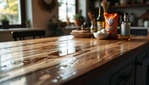
The movement away from cool-toned kitchens marks a significant transformation in design philosophy. Warm neutral colours such as soft terracotta, ochre and gentle brown tones are increasingly favoured by interior designers who recognise their ability to create inviting and comfortable environments. These shades introduce a sense of cosiness that cooler palettes simply cannot achieve, making the kitchen feel less like a sterile workspace and more like a genuine gathering place for family and friends.
Practical applications of warm tones
Implementing warm hues requires thoughtful consideration of various kitchen elements:
- Cabinet finishes in soft ochre or warm cream tones that catch natural light beautifully
- Wall colours in muted terracotta that add depth without overwhelming the space
- Accent pieces in richer brown shades to create visual interest
- Complementary wood finishes such as walnut that enhance the warmth
These warm neutrals pair exceptionally well with natural materials, creating a cohesive aesthetic that feels both contemporary and timeless. The versatility of these shades allows them to adapt to various lighting conditions throughout the day, maintaining their appeal from morning coffee to evening dinner preparations.
As these warmer tones establish themselves as design staples, another category of neutral colours offers a different approach to creating serene kitchen environments.
Timeless pastels in the kitchen
Soft colour choices with enduring appeal
Pastel neutrals provide an alternative to bolder warm tones whilst maintaining a gentle, welcoming atmosphere. These understated shades include soft whites, pale creams and delicate off-white variations that create bright, airy spaces without the harshness of pure white. Interior designers appreciate how these colours reflect light effectively, making kitchens feel more spacious whilst retaining a sense of warmth that cooler whites lack.
Balancing brightness with warmth
The key to successfully implementing pastel neutrals lies in understanding their undertones. Soft whites with subtle yellow or pink undertones prevent the space from feeling clinical, whilst pale cream shades introduce just enough colour to create visual interest. These choices work particularly well in kitchens with abundant natural light, where they can showcase their subtle variations throughout the day.
| Pastel Neutral | Best Application | Ideal Lighting |
|---|---|---|
| Soft White | Walls and ceilings | North-facing rooms |
| Pale Cream | Cabinetry | East-facing rooms |
| Off-White | Trim and details | South-facing rooms |
These gentle hues establish a foundation upon which other design elements can shine, creating a backdrop that never competes with decorative choices or functional features.
Whilst pastels offer lightness and airiness, another palette draws inspiration directly from the natural world to create grounded, organic spaces.
Earth-toned palette: the natural touch
Bringing the outdoors inside
Earth-inspired neutrals have emerged as particularly popular choices among designers seeking to create kitchens with organic, grounded aesthetics. Shades reminiscent of clay, stone and natural minerals introduce a connection to nature that feels both calming and authentic. These colours work harmoniously with the growing preference for sustainable materials and biophilic design principles that emphasise our innate connection to the natural environment.
Implementing earth tones effectively
The earth-toned palette encompasses a diverse range of neutral shades:
- Clay-inspired terracottas that add warmth without overwhelming
- Stone greys with warm undertones that feel sophisticated yet approachable
- Mineral taupes that bridge the gap between brown and grey
- Sandy beiges that evoke natural landscapes
These colours pair exceptionally well with natural materials in their authentic states. Textured tiles, wooden surfaces and metal fixtures in finishes like antique brass complement earth tones beautifully, creating a cohesive design narrative that celebrates natural beauty. The versatility of this palette allows it to adapt to both traditional and contemporary kitchen styles, making it an enduringly practical choice.
As earth tones celebrate natural materials, another neutral category takes a familiar colour in exciting new directions.
Reimagined shades of grey
Grey’s evolution in kitchen design
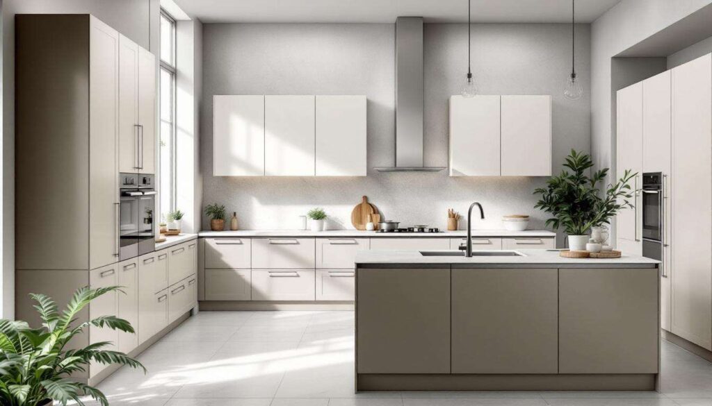
Whilst cool greys dominated kitchen design for years, reimagined grey tones now incorporate warmer undertones that create more inviting and versatile spaces. These updated greys move away from the stark, industrial feel of their predecessors, instead offering shades that feel softer and more accommodating. Designers now favour greige variations that blend grey with beige, creating neutral tones that maintain sophistication whilst introducing subtle warmth.
Modern applications of grey tones
Contemporary grey palettes offer numerous advantages in kitchen design. They provide a neutral backdrop that allows other design elements to shine whilst maintaining visual interest through their subtle complexity. These shades work particularly well in open-plan layouts where the kitchen needs to harmonise with adjacent living spaces, offering continuity without monotony.
The key to successfully implementing these reimagined greys lies in careful selection of undertones and thoughtful pairing with complementary colours and materials. Warm-toned greys pair beautifully with wood finishes and brass fixtures, whilst cooler variations can be warmed through textile choices and accent colours.
Building upon the versatility of modern greys, another palette draws inspiration from coastal environments to create tranquil kitchen spaces.
Sand and shell colours
Coastal-inspired neutral palettes
Sand and shell tones bring a sense of serenity and lightness to kitchen design, evoking the calming qualities of coastal environments without resorting to obvious nautical themes. These colours range from pale sandy beiges to soft shell pinks and creamy whites, creating spaces that feel fresh and airy whilst maintaining warmth. Interior designers appreciate how these shades introduce subtle colour variation whilst remaining firmly within the neutral spectrum.
Creating cohesive coastal-inspired spaces
Implementing sand and shell colours requires attention to texture and finish:
- Matte finishes that evoke natural materials
- Layering different tones within the same colour family
- Incorporating natural textures through tiles and surfaces
- Balancing warm and cool undertones for visual interest
These colours work particularly well in kitchens with good natural light, where they can showcase their subtle variations and create a sense of openness. They pair beautifully with white marble, light wood tones and brushed metal fixtures, creating a cohesive aesthetic that feels both refined and relaxed.
As sand and shell tones offer lightness and airiness, another sophisticated neutral provides depth and enduring elegance.
Elegance of taupe tones
Taupe as the ultimate neutral
Taupe has emerged as a premier choice for interior designers seeking to create kitchens with timeless sophistication and versatility. This complex neutral, which blends grey and brown with subtle purple or pink undertones, offers remarkable adaptability across various design styles. From traditional to contemporary kitchens, taupe provides a refined backdrop that never feels dated or overly trendy.
The versatility of taupe in kitchen design
Taupe’s popularity stems from its ability to harmonise with virtually any accent colour or material choice. It works beautifully with rich wood finishes, complements both warm and cool metal fixtures, and provides an elegant foundation for colourful accent pieces. Designers particularly appreciate how taupe adapts to different lighting conditions, maintaining its appeal throughout the day.
| Design Element | Taupe Application | Complementary Pairing |
|---|---|---|
| Cabinetry | Primary colour | Walnut wood, brass hardware |
| Walls | Lighter taupe shade | White trim, stone countertops |
| Island | Deeper taupe tone | Marble surfaces, pendant lighting |
Creating depth with taupe palettes
The most successful taupe kitchens layer different shades within the same colour family, creating depth and visual interest without introducing jarring contrasts. This approach allows for sophisticated colour blocking whilst maintaining the cohesive, calming atmosphere that neutral palettes promise. Pairing taupe with rich accent colours such as plum, burgundy or navy blue on islands or secondary elements adds personality whilst preserving overall harmony.
Neutral kitchen colours continue to evolve, reflecting changing priorities in how we use and experience these essential spaces. The shift towards warmer, more complex neutrals demonstrates a collective desire for kitchens that function as true living centres rather than purely functional workspaces. Whether choosing warm ochres, soft pastels, earth-inspired tones, reimagined greys, coastal sand shades or sophisticated taupes, these neutral palettes create environments that balance aesthetic appeal with genuine comfort. The emphasis on natural materials, thoughtful layering and versatile colour choices ensures these kitchens remain relevant and inviting for years to come, adapting gracefully to evolving tastes whilst maintaining their fundamental appeal.