Creating a harmonious and inviting living space requires careful consideration of every decorative element. Whilst personal style and individual expression remain important, certain decor choices can inadvertently transform a well-intentioned interior into a chaotic and overwhelming environment. Design professionals consistently identify specific items that, when used excessively or without proper planning, contribute to a cluttered aesthetic that diminishes the overall appeal of a room. Understanding which elements to moderate and how to curate your space thoughtfully can make the difference between a serene sanctuary and a visually exhausting environment.
The art of choosing your art pieces
Quality over quantity in artwork selection
Selecting artwork for your home should be a deliberate process rather than an impulsive accumulation. Design experts emphasise that too many art pieces competing for attention can create visual noise that detracts from the individual beauty of each work. Instead of covering every available wall surface, professionals recommend choosing fewer, more impactful pieces that truly resonate with your aesthetic vision and complement the room’s overall design scheme.
Creating breathing space around art
Proper spacing and placement are crucial elements in displaying artwork effectively. When pieces are hung too closely together or without consideration for the surrounding space, they can contribute to a sense of disorder. Consider the following principles:
- Allow adequate wall space around each piece to let it breathe
- Maintain consistent spacing between multiple works
- Consider the scale of artwork in relation to furniture and room dimensions
- Avoid mixing too many different frame styles and colours
The strategic placement of art can transform a room, but this transformation depends on restraint and thoughtful curation rather than quantity.
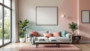
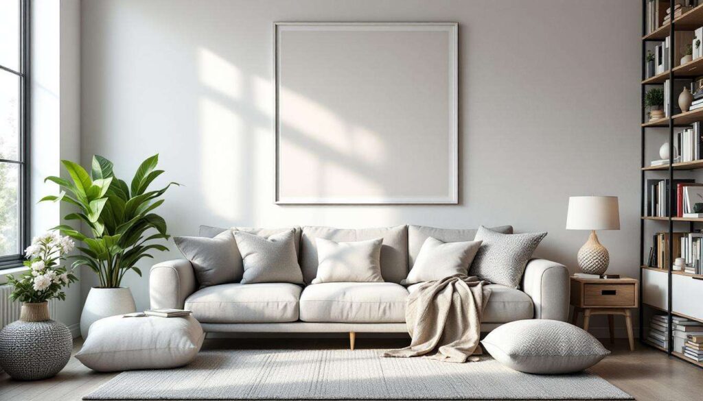
Avoiding overloaded cushions
The cushion conundrum
Whilst cushions undeniably add comfort and visual interest to sofas and beds, an excessive number creates a cumbersome appearance that overwhelms the furniture itself. Design professionals frequently encounter spaces where cushions have multiplied beyond functional necessity, requiring residents to remove multiple layers before sitting down. This practical inconvenience signals a decorative problem that needs addressing.
Finding the right balance
Achieving the perfect cushion arrangement requires understanding both aesthetics and functionality. Experts suggest limiting cushions to a carefully selected few that enhance rather than dominate the seating area. For a standard three-seater sofa, three to five cushions typically provide visual interest without creating clutter. Beds benefit from a similar approach, with two to four decorative cushions complementing the sleeping pillows rather than burying them.
| Furniture type | Recommended cushion count | Maximum before clutter |
|---|---|---|
| Three-seater sofa | 3-5 cushions | 6 cushions |
| Two-seater sofa | 2-3 cushions | 4 cushions |
| Double bed | 2-4 cushions | 5 cushions |
Choosing cushions in complementary colours and textures that align with the room’s palette creates cohesion whilst maintaining visual simplicity.
Streamlining matte black hardware
The matte black trend and its pitfalls
Matte black hardware has become increasingly popular in contemporary interior design, offering a sophisticated and modern aesthetic. However, design experts caution against overusing this trend throughout every room and on every surface. When matte black appears on door handles, cabinet pulls, light fixtures, taps, and decorative accessories simultaneously, it can create a heavy, monotonous appearance that weighs down the space rather than enhancing it.
Strategic application for maximum impact
The key to successfully incorporating matte black hardware lies in selective placement and mixing finishes. Consider using matte black as an accent rather than the default choice for all fixtures. Combining different finishes such as brushed brass, polished chrome, or natural wood creates visual interest and prevents the overwhelming effect of too much black. This approach allows the matte black elements to stand out as intentional design choices rather than contributing to a cluttered, overly coordinated appearance.
Understanding how different materials and finishes interact helps create a balanced environment where no single element dominates.
Limiting excessive use of Zellige tiles
The allure and overuse of Zellige tiles
Zellige tiles, with their handcrafted charm and distinctive glazed finish, have captured the attention of homeowners and designers alike. These Moroccan-inspired tiles bring texture, colour variation, and artisanal character to kitchens, bathrooms, and feature walls. However, their inherent visual complexity means that excessive use can quickly overwhelm a space, creating a busy, cluttered feeling that detracts from their individual beauty.
Thoughtful integration strategies
Design professionals recommend using Zellige tiles as focal points rather than covering entire rooms with them. A well-placed backsplash, a single accent wall, or a shower feature creates impact without visual overload. When Zellige appears on multiple surfaces or in several rooms, the effect becomes diluted and the space feels chaotic. Consider these guidelines:
- Limit Zellige to one or two key areas per room
- Balance intricate tile work with plain, neutral surfaces
- Choose colours that complement rather than compete with existing decor
- Avoid mixing Zellige with other highly patterned materials
The restraint exercised in tile placement allows these beautiful materials to shine without contributing to clutter.
Beware of overstuffed shelves
The storage versus display dilemma
Shelving serves dual purposes in most homes: practical storage and decorative display. When shelves become repositories for every available item, they transform from attractive features into cluttered eyesores. Design experts observe that overstuffed shelves create visual chaos, making rooms feel smaller and more disorganised regardless of how tidy the rest of the space might be.
Curating shelf displays effectively
The solution lies in treating shelves as curated galleries rather than storage solutions. Leaving negative space between objects allows each item to be appreciated individually and creates a sense of calm. Grouping items in odd numbers, varying heights, and incorporating both functional and decorative pieces creates interest without clutter. Remove items that don’t serve a clear purpose or contribute to the overall aesthetic vision.
This approach to shelf styling connects naturally to broader principles of wall decoration and visual balance.
Be wary of overcrowded gallery walls
The gallery wall phenomenon
Gallery walls offer an opportunity to showcase multiple pieces in a cohesive arrangement, but this decorating technique requires careful planning to avoid creating clutter. When frames of varying sizes, styles, and colours are hung without consideration for spacing, alignment, or visual flow, the result resembles chaos rather than curated artistry. Design professionals emphasise that successful gallery walls depend on restraint and intentional composition.
Principles for cohesive gallery walls
Creating an effective gallery wall requires planning the arrangement before hammering a single nail. Laying out the composition on the floor first allows experimentation with spacing and placement. Maintaining consistent spacing between frames, typically between 5 and 10 centimetres, creates visual unity. Limiting the colour palette of frames and mats helps tie disparate images together. Consider these essential elements:
- Plan the entire layout before installation
- Maintain uniform spacing between all frames
- Limit frame styles to two or three complementary options
- Choose a cohesive colour scheme for frames and artwork
- Leave adequate space around the gallery wall perimeter
A well-executed gallery wall becomes a focal point that enhances rather than clutters the space.
Achieving a clutter-free interior requires mindful curation of decorative elements rather than simply removing personality from your home. By exercising restraint with artwork, cushions, trendy finishes like matte black hardware, distinctive materials such as Zellige tiles, shelf displays, and gallery walls, you create spaces that feel intentional and serene. The common thread connecting these design principles is the importance of quality over quantity, thoughtful placement over abundance, and allowing each chosen element sufficient space to make its intended impact. A well-designed room balances personal expression with visual calm, proving that less truly can be more when it comes to creating a harmonious living environment.