
Creating a tranquil atmosphere in your home has become a priority for many homeowners seeking respite from the chaos of daily life. The colours we surround ourselves with play a crucial role in shaping our emotional wellbeing and mental state. While many assume that calming interiors rely solely on beige and grey, professional designers have proven that a diverse palette of soothing hues exists beyond the neutral spectrum. From soft blues reminiscent of coastal horizons to gentle greens that echo nature’s embrace, these carefully selected shades possess the remarkable ability to transform any room into a peaceful sanctuary. Understanding which colours promote relaxation and how to implement them effectively can revolutionise your living spaces, turning them into havens of serenity where stress melts away and calm prevails.
The Trend of Calming Colours in Interior Design
The shift towards calming colour palettes in contemporary interior design reflects a broader societal movement towards mindfulness and wellness. Designers have observed that clients increasingly request spaces that function as emotional sanctuaries rather than merely aesthetically pleasing rooms. This trend has accelerated as people spend more time at home, recognising the profound impact their environment has on their mental health.
Why Calming Colours Matter
The psychological effects of colour have been extensively studied, revealing that certain hues can lower blood pressure, reduce anxiety, and promote restful sleep. Interior designers leverage this scientific understanding to create spaces that actively contribute to occupants’ wellbeing. Soft, muted tones work by reducing visual stimulation, allowing the mind to relax rather than process intense chromatic information. This principle has become fundamental in designing bedrooms, bathrooms, and living areas where relaxation is paramount.
Popular Calming Shades Beyond Neutrals
Professional designers frequently incorporate these non-neutral calming colours into their projects:
- Powder blue: evokes clear skies and coastal tranquillity
- Sage green: connects interiors with the natural world
- Lavender: combines the stability of blue with the energy of red in gentle proportions
- Soft coral: provides warmth without overwhelming intensity
- Dusty rose: offers sophisticated comfort with subtle femininity
- Pale aqua: suggests water and promotes a spa-like atmosphere
These choices demonstrate that achieving serenity doesn’t require abandoning colour altogether. Understanding how to select the right calming shade for your specific space requires consideration of multiple factors.
How to Choose the Ideal Calming Colour for Your Space
Selecting the perfect soothing colour involves more than simply picking your favourite pastel. Room orientation, natural light levels, and intended function all influence which shades will work most effectively in your particular environment.
Assessing Your Room’s Natural Light
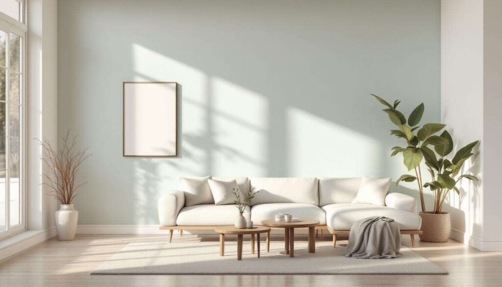
North-facing rooms receive cooler, less direct light throughout the day, making them ideal candidates for warmer calming colours such as soft peach or gentle terracotta. These hues compensate for the lack of warm sunlight whilst maintaining a peaceful atmosphere. Conversely, south-facing rooms bathed in abundant sunshine can accommodate cooler tones like pale blue or mint green without feeling cold or unwelcoming.
Matching Colour to Room Function
| Room Type | Recommended Calming Colours | Psychological Effect |
|---|---|---|
| Bedroom | Lavender, soft grey-blue, pale green | Promotes restful sleep and relaxation |
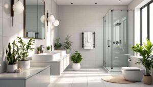
| Bathroom | Aqua, seafoam, pale turquoise | Creates spa-like tranquillity |
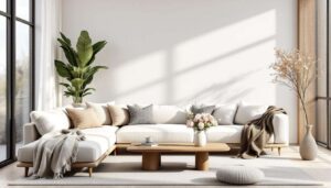
| Living Room | Sage, dusty rose, warm grey | Encourages conversation and comfort |
| Home Office | Soft blue, muted green, cream | Reduces stress whilst maintaining focus |
Testing Before Committing
Professional designers always recommend painting large sample squares on multiple walls before making a final decision. Colours appear dramatically different depending on the time of day and artificial lighting conditions. Observe your samples for at least three days, noting how they look in morning light, afternoon sun, and evening lamplight. This investment of time prevents costly mistakes and ensures your chosen shade delivers the calming effect you desire.
Once you’ve identified colours that work with your space’s technical requirements, exploring how natural tones can enhance that sense of calm becomes the next consideration.
Incorporating Natural Colours for a Calm Effect
Nature provides an endless source of inherently soothing colour combinations that designers frequently reference when creating peaceful interiors. These organic hues feel instinctively right because humans have evolved surrounded by them, making them particularly effective at promoting relaxation.
Earth-Inspired Palettes
Colours drawn from natural landscapes create immediate visual harmony. Terracotta, ochre, and warm sand tones reference earth and stone, grounding a space and providing psychological stability. These shades work exceptionally well in living areas and kitchens, where they create welcoming environments without sacrificing sophistication. Designers often pair these warmer earth tones with crisp white trim to prevent spaces from feeling heavy or dark.
Water and Sky References
Blues and greens inspired by water and sky have documented calming properties. Pale aquamarine reminds us of tropical shallows, whilst soft grey-blue echoes overcast skies. These colours lower perceived room temperature, making them ideal for spaces that receive intense sunlight or in warmer climates. Seafoam green particularly exemplifies this category, combining the tranquillity of blue with the renewal associations of green.
Botanical Greens
Plant-inspired greens range from pale sage to muted olive, each offering distinct calming qualities:
- Sage green: subtle and sophisticated, works in traditional and contemporary settings
- Celadon: a grey-green that provides serenity without feeling cold
- Pistachio: slightly warmer, adds gentle energy whilst remaining peaceful
- Eucalyptus: grey-toned green that pairs beautifully with natural wood
These botanical shades connect interior spaces with the outdoors, satisfying our biophilic need for nature connection even in urban environments. Complementing these natural tones with pastel variations expands your calming colour options further.
The Impact of Pastel Shades in a Serene Room
Pastel colours achieve their soothing effect through reduced colour saturation, which translates to less visual intensity and cognitive processing. These softened hues create enveloping environments that feel gentle and protective rather than stark or clinical.
The Science Behind Pastel Serenity
Pastels contain significant amounts of white, which dilutes the base colour’s intensity whilst maintaining its essential character. This dilution reduces the stimulation our eyes and brains experience when processing colour information. Research indicates that low-saturation colours correlate with decreased heart rate and lower cortisol levels, making pastels scientifically validated choices for calming interiors.
Unexpected Pastel Choices
Beyond predictable pale pink and baby blue, designers increasingly employ unconventional pastels:
- Blush: a sophisticated pink-beige hybrid that feels grown-up and serene
- Lilac: offers gentle colour without the sweetness of traditional lavender
- Peach: provides warmth and optimism whilst remaining subdued
- Pale grey-purple: creates mysterious, cocoon-like atmospheres
- Butter yellow: the softest yellow that brightens without stimulating
Balancing Pastels with Contrast
Whilst pastels excel at creating calm, rooms composed entirely of similar-toned pastels can feel washed out or lack definition. Designers recommend introducing subtle contrast through slightly deeper accent walls, textured fabrics in complementary shades, or natural wood tones that ground the ethereal quality of pastels. This approach maintains serenity whilst preventing spaces from feeling insubstantial or boring.
Successfully implementing these calming colours requires understanding specific techniques that designers employ to maximise their soothing potential.
Designers’ Tips for Using Non-Neutral Tones
Professional interior designers have developed proven strategies for incorporating colourful yet calming palettes that avoid common pitfalls whilst maximising tranquillity.
The 60-30-10 Rule for Calming Spaces
This classic design principle proves particularly effective with soothing colours. Allocate 60 percent of your room to your primary calming colour (typically walls), 30 percent to a secondary supporting shade (furniture and curtains), and 10 percent to accent colours that add visual interest. This distribution creates visual hierarchy that feels organised and peaceful rather than chaotic.
Layering Tones for Depth
Rather than using a single flat colour, designers create sophisticated calm by layering multiple shades within the same colour family. A room might feature walls in pale sage, upholstery in slightly deeper celadon, and accessories in muted olive. This tonal variation adds richness and prevents monotony whilst maintaining an overall serene atmosphere.
Strategic Placement of Bolder Calming Colours
When using less conventional calming shades like dusty rose or soft coral, consider these placement strategies:
- Feature walls: concentrate colour on one wall to create impact without overwhelming
- Lower wall sections: painting only below a dado rail grounds the colour and reduces visual intensity
- Ceiling applications: unexpected placement of calming colour overhead creates enveloping comfort
- Architectural details: reserve bolder shades for alcoves, built-in shelving, or window recesses
Combining Calming Colours with Texture
Texture significantly influences how we perceive colour. Matte finishes absorb light and intensify the calming effect of soft colours, making them ideal for bedrooms and meditation spaces. Subtle sheens reflect gentle light, adding dimension without creating harsh glare. Designers often specify eggshell or satin finishes for living areas where some light reflection prevents colours from appearing flat or dull.
Creating a truly calming interior extends beyond paint selection to encompass lighting, furnishings, and accessories that support your chosen palette. Warm, dimmable lighting enhances the soothing qualities of most calming colours, whilst harsh overhead fixtures can negate their peaceful effects. Natural materials like linen, cotton, and wool in complementary tones reinforce the tranquil atmosphere, as do organic shapes and uncluttered arrangements.
The journey towards a more serene home environment begins with understanding that calming colours extend far beyond basic neutrals. From nature-inspired greens and blues to sophisticated pastels in unexpected hues, the palette available for creating peaceful spaces offers remarkable variety. Success lies in carefully assessing your room’s characteristics, selecting colours that align with both function and light conditions, and implementing them using proven design techniques. Whether you choose sage green for its botanical connections, pale aqua for its water associations, or dusty rose for its gentle warmth, these thoughtfully selected shades possess the power to transform your home into a genuine sanctuary where stress diminishes and tranquillity prevails.