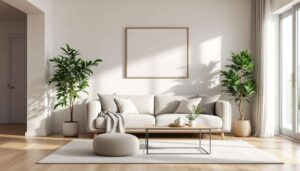
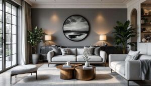


Living rooms serve as the heart of the home, where families gather and guests are welcomed. Yet even the most well-intentioned decorating choices can undermine the comfort and aesthetic appeal of this essential space. Interior designers consistently identify certain elements that detract from a living room’s functionality and visual harmony. Understanding these common pitfalls enables homeowners to create environments that feel both inviting and professionally curated. From lighting missteps to furniture scale issues, these design errors can transform a potentially beautiful room into a space that feels awkward or overwhelming.
Inappropriate lighting fixtures
The impact of mismatched scale
Lighting fixtures that fail to correspond with room proportions create immediate visual discord. Chandeliers that overwhelm modest spaces or undersized pendants in expansive rooms disrupt the balance designers work to achieve. A fixture should complement the ceiling height and floor area, with general guidelines suggesting that chandelier diameter in inches should equal the room’s length plus width in feet. When this relationship falters, the entire room feels disproportionate.
Poor light quality considerations
Beyond size, the quality and colour temperature of light profoundly affect ambience. Designers caution against harsh, cool-toned lighting that casts unflattering shadows and creates clinical atmospheres. Living rooms benefit from layered lighting approaches that include:
- Ambient lighting for overall illumination
- Task lighting for reading and activities
- Accent lighting to highlight architectural features
- Dimmable options for flexibility
Fixtures with inadequate wattage or poorly positioned bulbs leave corners in shadow whilst creating glare in others, making the space feel uncomfortable and poorly planned.
Whilst lighting establishes the mood, the physical elements within a room determine how comfortably people can move and interact within the space.
Overly large furniture
Circulation and flow problems
Furniture that dominates floor space compromises a living room’s fundamental purpose. Oversized sectionals that consume entire walls or coffee tables that obstruct pathways create frustration rather than comfort. Designers recommend maintaining at least 45 centimetres of clearance for walkways, with 60 to 90 centimetres being ideal. When furniture encroaches on these zones, rooms feel cramped regardless of their actual dimensions.
Visual weight concerns
Beyond physical space, bulky furniture pieces carry visual weight that can make rooms appear smaller and darker. Deep sofas with thick arms, heavy wooden entertainment centres, and substantial recliners all contribute mass that overwhelms rather than enhances. The following table illustrates appropriate furniture proportions:
| Room size | Sofa length | Coffee table size |
|---|---|---|
| Small (under 15 m²) | 180-200 cm | 90 x 60 cm |
| Medium (15-25 m²) | 200-230 cm | 120 x 75 cm |
| Large (over 25 m²) | 230-270 cm | 140 x 80 cm |
Selecting appropriately scaled pieces allows the architecture to breathe and creates a sense of spaciousness that enhances daily living.
Just as furniture scale affects spatial perception, the artwork adorning walls requires similar consideration of proportion and placement.
Oversized art
Wall proportion guidelines
Artwork that dwarfs the furniture beneath it or extends too close to ceiling edges creates visual imbalance. Designers typically recommend that art occupy approximately two-thirds to three-quarters of the furniture width below it. A piece measuring 180 centimetres wide above a 150-centimetre sofa appears disproportionate and draws attention to the mismatch rather than enhancing the space. Proper scaling ensures artwork complements rather than competes with surrounding elements.
Height placement errors
Beyond width considerations, hanging art too high or too low disrupts visual flow. The centre of artwork should align with eye level, typically 145 to 150 centimetres from the floor. Oversized pieces hung incorrectly force viewers to crane their necks or stoop uncomfortably, whilst also making ceilings appear lower and rooms feel compressed.
Colour choices wield similar power to either harmonise or destabilise a living room’s overall composition.
Excessive colour palette
The rule of three
Interior designers frequently employ the 60-30-10 colour rule to create cohesive schemes: 60 per cent dominant colour, 30 per cent secondary colour, and 10 per cent accent colour. Living rooms that abandon this principle in favour of multiple competing hues feel chaotic and visually exhausting. Too many colours prevent the eye from resting, creating spaces that lack the tranquillity living rooms should provide.
Pattern overload
Compounding colour excess, rooms featuring numerous competing patterns intensify visual confusion. When florals clash with geometrics, stripes compete with paisley, and animal prints vie for attention, the result overwhelms rather than delights. Successful spaces limit patterns to:
- One large-scale pattern as a focal point
- One medium-scale pattern for interest
- One small-scale pattern or texture for depth
- Solid colours to provide visual relief
Restraint in colour and pattern selection allows individual elements to shine whilst maintaining overall harmony.
Window treatments represent another area where thoughtful selection proves essential to achieving a polished appearance.
Poorly chosen curtains
Length and proportion mistakes
Curtains that hover above the floor or puddle excessively create an unfinished or dated appearance. Designers advocate for panels that either just kiss the floor or break slightly, extending 1 to 2 centimetres beyond floor level. Similarly, mounting curtain rods too close to window frames makes windows appear smaller and ceilings lower. Rods should be positioned 10 to 15 centimetres above the window frame and extend 15 to 25 centimetres beyond each side.
Fabric and style inconsistencies
Curtain fabric weight and style must align with the room’s overall aesthetic. Heavy velvet drapes in minimalist contemporary spaces or sheer voiles in traditional formal rooms create jarring disconnects. The texture, opacity, and embellishment level should reinforce rather than contradict the established design language.
Technology has become increasingly present in living spaces, yet its integration requires careful consideration to maintain aesthetic integrity.
Cluttered electronics
Cable management failures
Visible tangles of cables trailing from televisions, speakers, gaming consoles, and charging devices immediately undermine a room’s polish. Exposed wiring creates visual noise that distracts from intentional design elements. Solutions include:
- Cable management boxes that conceal power strips
- Cord covers that blend with walls
- Furniture with integrated wire management
- Wireless technology where feasible
Device proliferation
Multiple remotes, charging stations, and peripheral devices scattered across coffee tables and side tables create clutter that designers work to eliminate. Dedicated charging drawers, concealed storage for remotes, and consolidated entertainment systems maintain functionality whilst preserving clean surfaces. The goal involves integrating necessary technology without allowing it to dominate the visual landscape.
Creating a living room that feels both comfortable and aesthetically refined requires attention to these fundamental design principles. By avoiding inappropriate lighting, oversized furniture and art, excessive colour schemes, poorly chosen window treatments, and visible electronic clutter, homeowners can achieve spaces that function beautifully for daily life whilst reflecting professional design sensibility. Each element should contribute to a cohesive whole rather than competing for attention, resulting in rooms that genuinely serve as welcoming hearts of the home.